
In case you missed it, be sure to check out Dining Room Update: Part One in my short series of our dining room update and our sometimes successful and sometimes failing process! Spoiler alert….it began as a great DIY effort and ended in the hands of a much-needed professional!
But….on to Part Two!
After calling in our buddy, Mr. Clay!, we knew we were in good hands. He came right in with a massive scraper which he proceeded to show me could cut your finger if you weren’t careful….he proved it, too! Yikes!
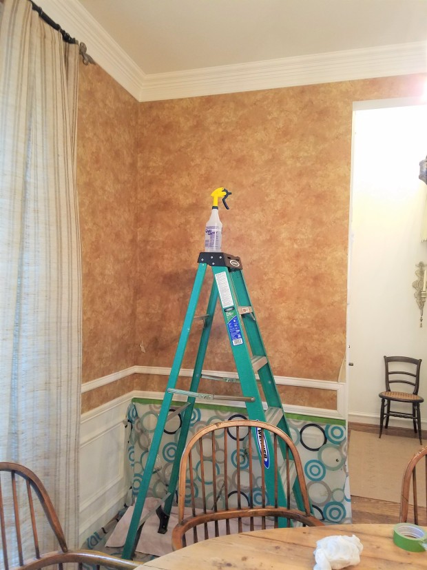
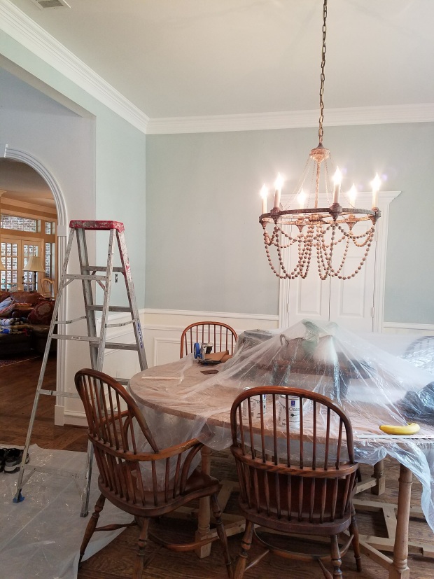
Our dining room has a double chair rail molding, and the previous owners had dropped a strip of wallpaper in that narrow space. It really seemed to chop up the vertical visual appeal and make the space appear smaller. We decided that in the process, we would tie that area into the white space below the chair rail moldings making it more cohesive and simple looking. It actually made the dining area feel larger in the long run!
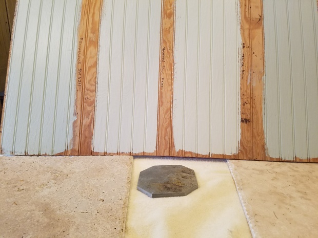
Mr. Clay also came in with a big bucket of “mud!” Mud? On our walls?! Well, for those that aren’t familiar, mud is basically a plaster that is pasted on over any imperfections or texturing to smooth out the surface and prep it for painting.
After rinsing to soften any paper left over and scraping it clean, Mr. Clay proceeded with filling in the holes we had caused in our overzealous and amateur wallpaper removal attempts. To be clear, we totally could have done it ourselves (yeah, right!). 🙂
While the mud was drying, we tested out a few places for our paint color. I had used Benjamin Moore’s Gray Wisp on my front door to update it from midnight to a gray-green-blue tone! It looked like it would be the perfect neutral in my dining room! Wrong!! It was so very dark!
Back to the drawing board. I loved this color, but the shade was way too dark. Back to the store to try a different variation of that color. Did you know you can request a color with variations in saturation? For instance, we asked for a color sample of Gray Wisp in 50% saturation and 25% saturation. That means that the color would be 50% lighter than the original and 75% lighter than the original. We came home and painted big squares of each one on the wall and watched how the light hit it throughout the weekend. The 25% paint looked “icy” and too cool for us. I have lots of warms tones in my home, and it simply wouldn’t work. The 50% was almost a little darker than we wanted, but we went with it anyway.
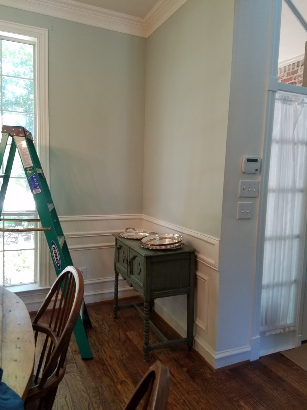
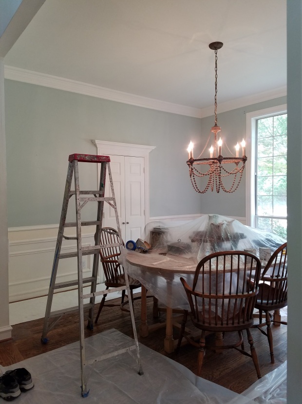
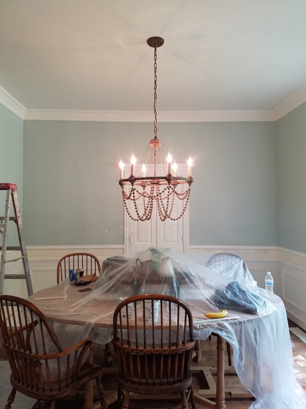
Monday morning, Mr. Clay arrived ready to paint! One coat on! Looked really good! Two coats, and it was a completely different room! Trim freshened with a white oil based paint, and there was a WOW! factor! The paint came out to be exactly what we wanted…not blue, not green, not gray…a more classic color that should stand the test of trends and time!
All I could think was “why did we wait nine months for this easy transformation?!”
Suddenly you could see my beautiful honey colored farm table and my chandelier draped in wooden pearl beads! It all had new purpose and popped against this beautiful color!
Stay tuned for the next part in the series…the most fun part…decorating!!
And, again, in case you missed part one, here you go!
3 thoughts on “Dining Room Update: Goodbye Paper & Hello Paint”
Comments are closed.